Redesigning Qataloog’s Digital Experience

Redesigning Qataloog’s Digital Experience

Redesigning Qataloog’s Digital Experience

Qataloog is an EdTech platform designed to provide accessible, high-quality learning resources for students of all ages. It offers a wide range of courses, interactive tools, and personalized learning paths, empowering learners to develop skills at their own pace.

Qataloog is an EdTech platform designed to provide accessible, high-quality learning resources for students of all ages. It offers a wide range of courses, interactive tools, and personalized learning paths, empowering learners to develop skills at their own pace.

Mobile App

Landing Pages

Web App

Admin

Dashboards

Email Templates

Pitch Decks

User Testing

Mobile App

Landing Pages

Web App

Admin

Dashboards

Email Templates

Pitch Decks

User Testing

My role

UX Designer

UI Designer

User Researcher

Tools

Figma, Photoshop

Year

2024 - Present

2024 -

Present

The Problem

1.Unengaging User Interface

The initial design of the Qataloog web app lacked visual appeal and engagement, making it difficult for users to navigate and interact effectively. This resulted in poor user retention and a suboptimal learning experience.


2. Inconsistent Branding

The web app did not have a cohesive visual identity, leading to a fragmented experience. This inconsistency weakened brand recognition and trust among users.


3. Sparse Design Elements

The previous design was minimal to the point of looking unfinished and unprofessional. The lack of structured design elements failed to communicate the platform’s full functionality and reliability.


4. Inconsistent UI Components

Various UI elements, such as buttons, navigation menus, and tables, were applied inconsistently throughout the web app. This inconsistency caused confusion and disrupted the overall user experience.

The Solution

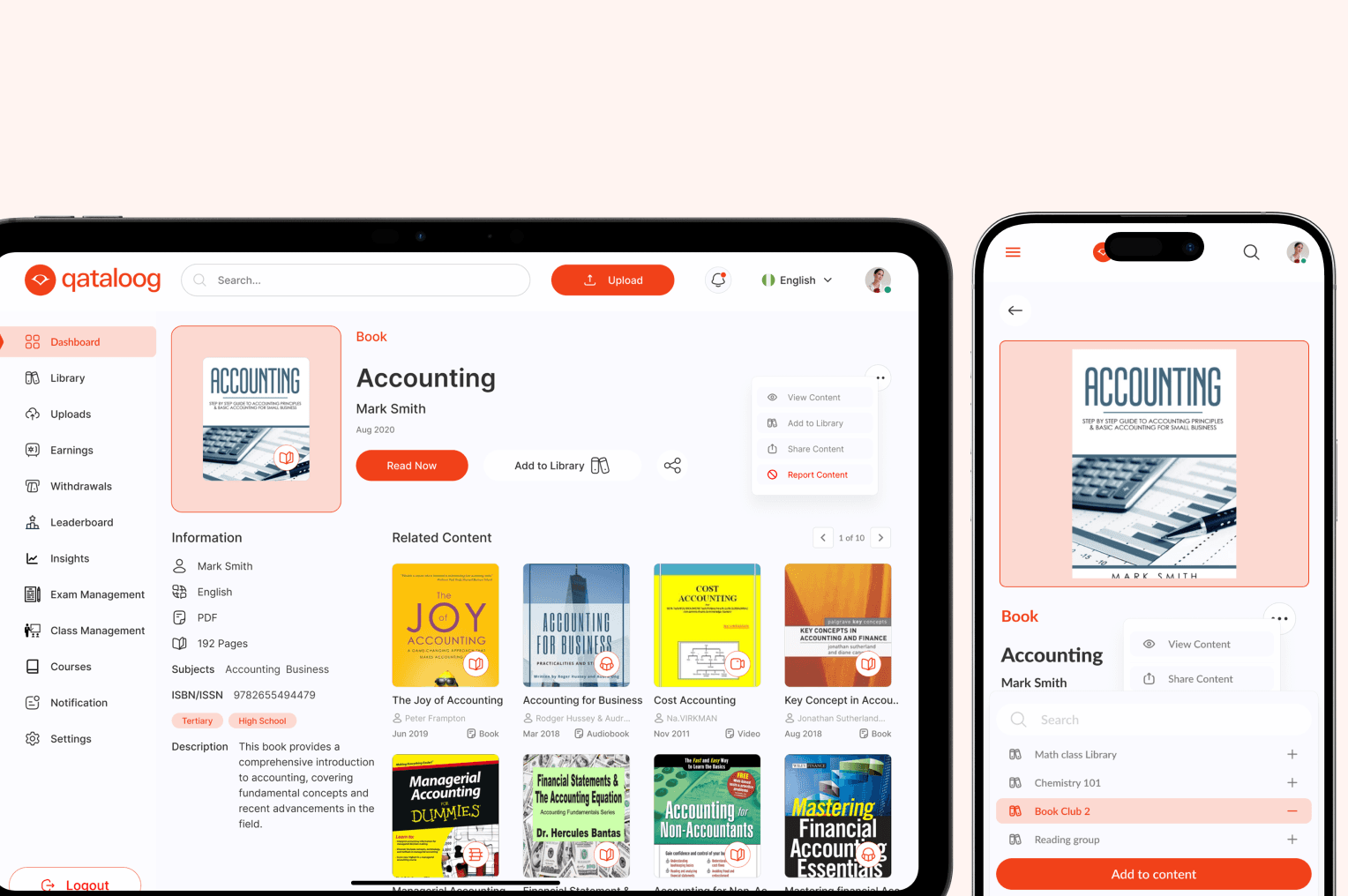
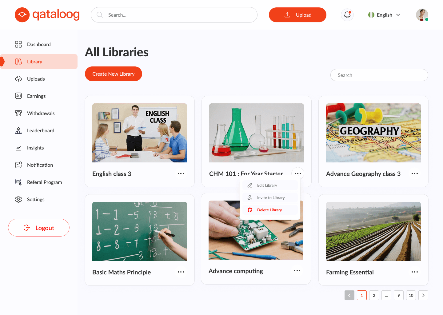
Developed a Cohesive Brand Identity

Introduced a consistent visual language, including typography, colors, and design patterns, to establish a professional and recognizable brand.


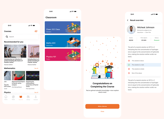
Redesigned Key Sections

Improved the structure and layout of essential sections such as the dashboard, course pages, and interactive tools to enhance usability and engagement.


Standardized UI Components

Created a unified design system with reusable UI elements, ensuring consistency across all screens and interactions within the web app.


Enhanced User Experience

Implemented intuitive navigation, clear call-to-actions, and interactive elements to streamline user interactions and improve overall accessibility.

Design Process

Research & DiscoveryConducted in-depth user research through interviews, surveys, and analytics to understand pain points and user behavior. Analyzed competitors and industry trends to identify opportunities for improvement. Collaborated with stakeholders to align design goals with business objectives.


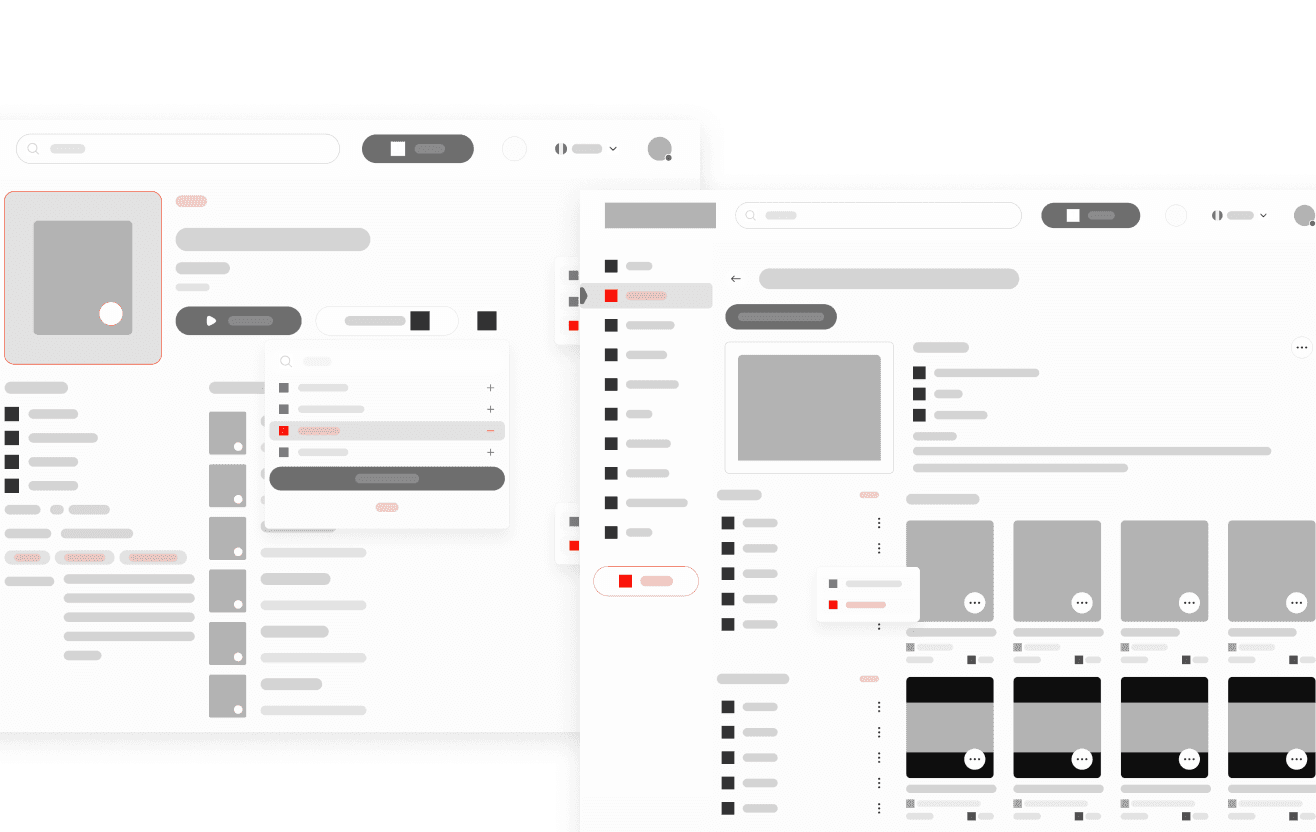
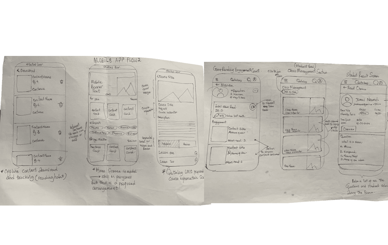
Ideation & WireframingCreated detailed user personas and journey maps to visualize user flows. Developed low-fidelity wireframes to experiment with layout and functionality, ensuring a logical structure that addressed usability challenges.


Prototyping & Visual DesignDesigned high-fidelity, interactive prototypes in Figma to simulate real user interactions and refine workflows. Established a modern, accessible, and engaging visual identity that enhanced trust and professionalism.


Usability Testing & IterationConducted usability testing with real users to gather insights on navigation, usability, and engagement. Iterated on the design based on feedback, optimizing performance, reducing friction, and ensuring accessibility compliance.


Development Handoff & Implementation SupportCreated comprehensive design documentation, including component libraries, style guides, and interaction guidelines. Worked closely with the development team to ensure a smooth handoff, providing ongoing support to refine implementation and maintain design integrity.


Key Metrics

35%

35%

35%

decrease (from 68% to 42%), reducing drop-offs and improving first impressions.

decrease (from 68% to 42%), reducing drop-offs and improving first impressions.

decrease (from 68% to 42%), reducing drop-offs and improving first impressions.

85%

85%

85%

of surveyed users reported that the platform now feels more intuitive, visually engaging, and easier to navigate

of surveyed users reported that the platform now feels more intuitive, visually engaging, and easier to navigate

of surveyed users reported that the platform now feels more intuitive, visually engaging, and easier to navigate

25%

25%

25%

increase , reflecting a more intuitive user experience and clearer calls to action.

increase , reflecting a more intuitive user experience and clearer calls to action.

increase , reflecting a more intuitive user experience and clearer calls to action.

~4minutes

~4minutes

~4minutes

(120% increase, from 1m 45s to 3m 50s), showing higher engagement with the platform.

(120% increase, from 1m 45s to 3m 50s), showing higher engagement with the platform.

(120% increase, from 1m 45s to 3m 50s), showing higher engagement with the platform.

Let’s

Work

Together

I’m currently available for new opportunities! If you’re looking for a product designer to bring your next big idea to life, let’s connect and make it happen!

Contact Me

Let’s

Work

Together

I’m currently available for new opportunities! If you’re looking for a product designer to bring your next big idea to life, let’s connect and make it happen!

Contact Me

Let’s

Work

Together

I’m currently available for new opportunities! If you’re looking for a product designer to bring your next big idea to life, let’s connect and make it happen!

Contact Me